| Previous Chapter | Next Chapter |
|
|
|
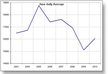
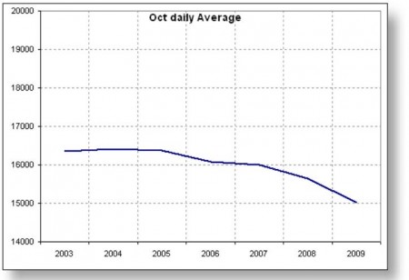
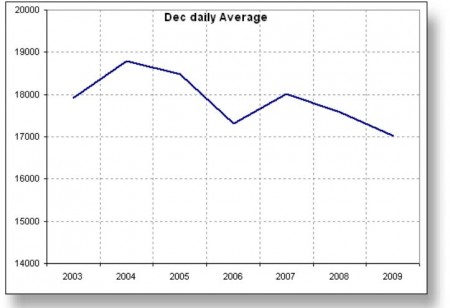
The following graphs show the averge daily demand in each month per year.


The drop on demand since 2004 is very clear. If we are into a recovery, it can be seen to start May of 2010, as each month then on shows an increase in the average daily demand. Note that Oct, Nov, and Dec don’t have 2010 data, not there yet.
|
|
|
| Previous Chapter | Next Chapter |